Publicado
Databases of digital fonts as sources for providing alternatives for font selection
Bases de datos de fuentes digitales como fuentes para proporcionar alternativas para la selección tipográfica
Bases de données de polices numériques comme sources pour fournir des alternatives pour la sélection de polices
Basi di font digitali come fonti per la fornitura di alternative per la selezione dei caratteri
Bancos de dados de fontes digitais como fontes para fornecer alternativas para seleção tipográfica
DOI:
https://doi.org/10.15446/actio.n1.95537Palabras clave:
Typography, Typeface design, Font selection, Design parameters, Databases (en)Typography, Tipografia, Disegno di carattere, Selezione dei caratteri, Parametri di progettazione, Banche dati (it)
Typographie, Typeface design, Sélection des polices, Paramètres de conception, Bases de données (fr)
Tipografia, Design de tipo de letra, Seleção de fonte, Parâmetros de projeto, Bases de dados (pt)
Tipografía, Diseño de tipografía, Selección de fuente, Parámetros de diseño, Bases de datos (es)
Descargas
Given the sheer number of typefaces available in the market and the predominance of intuitive criteria during the process, font selection (even after a general decision regarding the features of the fonts sought after has been made) is a difficult task for both, students and professional graphic designers. A more rational, systematic approach is proposed, based on objective formal attributes and design parameters derived from Gerrit Noordzij’s ideas and Erik van Blokland’s TypeCooker methodology. This paper intends to show that digital font data bases and simple algorithms can be used to refine a font search, a convenient approach to most graphic designers, type designers, font foundries, and design educators.
Debido al inmenso número de tipografías disponibles en el mercado y a la predominancia de criterios intuitivos, la selección de fuentes se ha convertido en una tarea difícil para los estudiantes y para los profesionales en diseño gráfico, inclusive después de que se ha tomado una decisión general sobre las características de las fuentes buscadas. Se propone un enfoque racional y sistemático basado en atributos formales objetivos y parámetros de diseño derivados de las ideas de Gerrit Noordzij y de la metodología TypeCooker de Erik van Blokland. Se intenta mostrar que las bases de datos de las fuentes digitales y algoritmos simples pueden ser utilizados para refinar la búsqueda de fuentes. Este artículo ofrece una información metodológica útil para la mayoría de diseñadores gráficos, diseñadores tipográficos, fundiciones tipográficas y educadores de diseño.
Dû au grand nombre de polices de caractère disponibles sur le marché et à la prédominance de critères intuitifs, la sélection des sources s’est convertie en une tâche difficile pour les étudiants et les professionnels du design graphique, y compris depuis qu’une décision générale a été prise sur les caractéristiques des sources recherchées. L’auteur de cet article propose une approche rationnelle et systématique basée sur des attributs formels objectifs et de paramètres de design dérivés des idées de Gerrit Noordzij et de la méthodologie TypeCooker développée par Erik van Blokland. De plus, il essaie de montrer que les bases de données des sources digitales et les simples algorithmes peuvent être utilisés pour affiner la recherche de sources. Cet article offre une information méthodologique utile pour la majorité des designers graphiques, typographiques, des fonderies typographiques et des enseignants en design.
Dovuto all’immenso numero di caratteri tipografici disponibili nel mercato ed alla predominancia di criteri intuitivi, la selezione di fonti è diventato un compito difficile per studenti e professionisti del design grafico, perfino dopo che si è preso già una decisione generale sulle caratteristiche delle fonti cercate. Si proporsi un approccio razionale e sistematica basato su attributi formali ed obiettivi, ed in parametri di design derivati delle idee di Gerrit Noordzij e della metodologia TypeCooker di Erik va Blokland. Si cerca di mostrare che i database delle fonti digitali ed algoritmi semplici possono essere utilizzati per raffinare la ricerca di fonti. Questo articolo offre un’informazione metodologico utile per la maggioranza di designer grafici, designer tipografici, fonderie tipografiche e professori o maestri di design.
Dada a enorme quantidade de tipografias disponíveis no mercado e do predomínio de critérios intuitivos, a seleção de fontes virou um trabalho difícil tanto para estudantes quanto para designers profissionais, mesmo logo depois de decidir sobre os critérios gerais para a sua busca. É proposto um enfoque racional e sistemático, baseado nas qualidades formais objetivas e os parâmetros de design provenientes das ideias de Gerrit Noordzij assim como da metodologia TypeCooker de Erik van Blokland. É pretendido amostrar que os bancos de dados das fontes digitais e os algoritmos simples podem ser usados para refinar a procura de fontes. Esse artigo oferece informação metodológica útil para a maioria dos designers gráficos e tipográficos, para os artífices tipográficos e os educadores do design.

ACTIO NÚM. 1 | Enero - Diciembre / 2017

Associate professor at the School of Graphic Design, Universidad Nacional de Colombia. Graphic and typeface designer.
capuertasc@unal.edu.co
ID ORCID: orcid.org/
Introduction
Computers make our lives easier by calculating what we humans simply cannot. Design today is a computer-based activity and most of us, designers and non-designers, cannot imagine a world without computers and applications. Fonts in the form of computer data (digital fonts) have already been around at least since 1972, when the Ikarus format was started (Karow, 2013, p. 16). Color palettes are now being made using the Adobe Kuler or similar apps. Web design and book design today are mostly automated. In the realm of typography, GREP styles1 solve almost instantly what it used to take hours via the find and replace menu or manual editing.
Type design, too, has become dependent on digital technology. Bézier curves, Python scripts and Open Type features are just a few of the many adaptations made by software engineers in order to translate typographic traditions into machine language so that we can exercise a profession in this digital age. However, font selection is still considered an art and many designers do not think about computers as anything but a simple means to an end. Can this situation be reversed? Can we use the power of computers to help font selection?
To answer these questions let us have a look at how graphic designers choose type nowadays. A few may attempt to consider a number of variables such as optical size, intended use, language support, etc. along with more subjective criteria such as its mood or its visual connotations within a given cultural context (Balius & Sesma, 2010). However, most will probably choose type like they were picking the flavor of an ice cream and therefore fail to consider most of their options. Mental shortcuts such as availability, or cognitive biases such as authority and representativeness, among others tend to affect the decision-making process leading designers to choose what they are already familiar with, what looks like what they need to represent or what they have been told to pick when in doubt rather than what they would pick if they were more aware of both the massive amount of options and the cognitive processes taking place when they design (McRaney & Dobelli, 2011).
What if their intuition was just one of the many tools used by designers to choose type? What if an automatic tool for choosing type could be designed, based on all the digital information that we currently have? At least hypothetically, basic data analysis applied to font design and font selection could yield surprising results and help us understand more about typography than any type classification system devised in the centuries before has been able to.
Design and parameters
Sometimes we tend to forget that fonts are computer data: a database of Bézier curves drawings that only make sense when used to write something. An incredibly diverse yet highly structured array of shapes which need to have many things in common in order to deserve to be together in the same file. Those things in common being the key to its usefulness, its reason to be or to exist. Its DNA.
We are now talking about design attributes. The characteristics some type designer has given to a set of glyphs intended for writing anything you want. Those decisions are either made with specific intention in mind or with a purpose yet to be discovered.
Some of those decisions, no matter how crazy or diverse, have something in common with other decisions. We can all see that a fat letter and a thin one from the same type family have something in common, regardless of how different they may seem. When we stop seeing isolated decisions and are instead able to see ranges of possible decisions, we see what we can call a design parameter.
Parameter comes from the Ancient Greek παρά, meaning "beside, subsidiary" and μέτρον, which means "measure". In its common usage, the term identifies a characteristic, a feature, a measurable factor that can help in defining a particular system. A parameter is an important element to take into consideration for the comprehension of a situation.
Parameter-based type design probably started during and thanks to the information age. In 1979, Donald Knuth published Metafont, a true innovation in the field of parametric fonts which is described as follows:
The main components of letters such as horizontal, vertical, diagonal and round strokes are described as the path of a pen with given orientation and pen width. A sequence of them with individual pen stresses, positions and directions describes a character and generates its outline. (Karow, 2013, p. 30)
Gerrit Noordzij is considered another of the pioneers of type design by parameters. In 1985 he published a theoretical model of letter shape variations in three dimensions which was later called Noordzij’s cube. This model is important because it allows us to think about the possible outcomes of the interaction between contrast amount, contrast kind and weight, the primary forces that give shape to writing in the Western world. A very interesting, new way to understand type which is still regarded as one of the greatest ideas in type design in the last few decades (Noordzij, 2005).
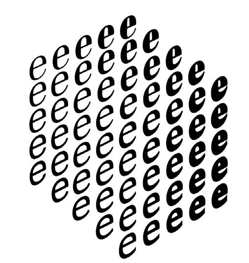
Fig. 1. Noordzij’s Cube, a theoretical model devised by Gerrit Noordzij that represents the theoretical relationships between contrast type, contrast amount and stroke width in typeface design.
Erik van Blokland’s TypeCooker, a model intended to teach type design based on the ideas of Gerrit Noordzij, can also be seen as a program, but one of a different kind, one which is considered a starting point in the development of ideas challenging the notion of type classification systems as well as any other fixed notions about type.
In Typecooker we are able to conceive the shapes of typographic letters as the result of the interaction between design decisions in several parameters. Used correctly and consistently, we can learn how to draw any combination imaginable.
In complete harmony with this notion, Donald Knuth designed his Metafont, a language for font description. Metafont is “a system that allows you to describe a typeface once, and create as many fonts of this typeface as you like by just changing a set of well-chosen parameters separately” (Grandsire, 2004, p. 9).
But Knuth’s Metafont is rather hard to learn to use for most type designers and artists. Besides, it can neither generate shapes out of nothing nor cover the entire range of shapes that are possible (Hofstadter, 1982). Just van Rossum’s DrawBot lessons at the KABK seem to be the farthest most type designers have been able to go in terms of type design by parameters.
Other systems such as Panose, have proven to be relatively useful in different fields. Almost all applications and operating systems dealing with fonts or providing the possibility of linking a font file to a document have been using it since the 1980s. In the Panose system, each number represents a value that defines each one of the ten parameters in a text typeface: family kind, serif style, weight, proportion, contrast amount, stroke variation, arm style, letterform, midline and x-height (De Laurentis, 1993).
The Panose system conceives the design of a font as a collection of many discrete (discontinuous and easy to identify) decisions that have been made to configure a font inside a range of possibilities or design space, so that a missing font can be compared with others by a computer program and its closest match can be found.
However, the Panose system is far from perfect and has its own, big limitations. For example the lack of precision implied in the process of defining all the possible expressions inside a parameter: what “low contrast” means to one designer, could signify “moderate low contrast” for another. The difference between them is visible because our visual cortex is more developed than our linguistic abilities: we can see more colors than we can identify with a name. Another problem with Panose is that not all foundries or designers use it perhaps because they do not understand it, know how it works or acknowledge its significance. Some problems come from the system itself, whereas others come from its implementation.
What for?
Finding the right font for a design project can be a cumbersome task. Historically, two main approaches have been the most widespread. The morphologic one seems to be the oldest: names such as Thibaudeau, Vox, and Novarese may be familiar to the reader. The morphologic, stylistic approach is also the origin of most type classification systems (Bringhurst, 2004). Conceiving shapes separate from their meanings can provide a technical, rather objective insight.
In contrast, the semantic approach, increasingly popular since the implementation of the Web 2.0 and currently used by most large type foundries, seizes morphology to “tag” fonts in ways that make sense by the user. For example, a tag such as “friendly” can be used in fonts both rounded and broken as long as their features do not conflict with the concept of “friendliness”. In this approach, the same shapes can mean very different things to the user since the overall effect as well as the cultural context are more important than the intrinsic values of these shapes (Kupferschmid, 2013).
Type can be chosen using any of the approaches aforementioned, but we are now focusing on the former, the morphologic approach. As Typecooker has demonstrated, parameter-based type design methods are powerful and effective when it comes to understanding the basics of type design and perhaps even conceiving new ideas for typefaces. Besides, it could also be used for different purposes such as evaluating existing typefaces and/or choosing the right ones for a given project. Or at least, that is one idea we should put to the test. This is how I suggest this could be done.
Most designers, who have a font library in their computers, need to use it often in order to make design decisions such as choosing a font for their projects. However, within this number of fonts some of them are very similar and for most beginners it can be hard to tell the difference between one or the other. They may feel tempted to make choices based exclusively on taste, sometimes with terrible consequences. They may not know what a font has been specifically designed for or even which font attributes are more suitable for a given design commision. The less typographic education you have, the more likely the need for some sort of tool which can help you with the task.
Since this is all digital data, and each font has nearly unique proportions, why not use that information to make slightly less intuitive choices on typeface selection? Subjective judgment will always be a part of the design process, however, can we at least try to confine it momentarily?
So I took my entire type library, consisting mostly of system fonts. Some of them happened to be my own designs so I thought it would be nice to include them in order to see how similar to or different from others they would be. At this point, I realized more people like me could be interested in doing the same, too. All it takes is a spreadsheet, a bunch of digital fonts in almost any format, a font editor, and some patience to take the measurements. Since it takes about three minutes to measure each font, you can collect enough data to make your own comparisons in no more than a single day of work.
Of course, this does not mean all designers should choose a typeface only after spending one day measuring their candidate fonts and/or after having analysed all the data. This is just an experiment to see if fonts can be measured, those measurements compared to generate proportions, and those proportions compared in order to choose better or at least dispose of sufficient information to make the best possible choices.
Measurements and proportions
Many design decisions that make a typeface unique can be compared. The size of the character set, supported languages, year of design, etc., are among the many dimensions that can be collected and used to inform type selection. However, let us focus on shape and the horizontal (x) and vertical (y) measurements that represent it.
Vertical measurements taking place in the y axis determine things such as how large a text set in a given typeface looks as well as how much far apart two lines of text seem. The thin parts of letters and other signs happen along this axis too and this is definite to measure the contrast.
Horizontal measurements in the x axis are responsible for the weight of the text (how thin or thick letters look) as well as for how much space it occupies (advance width). These two are crucial in many applications since weight perception is affected by size and reading distance sometimes making words unreadable.
In order to ensure all the measurements would be comparable, the first thing I did was to consider the UPM size of each font. UPM stands for units per M. This is the vertical size of the “virtual” paper, each character of the font is drawn over, the body size. The UPM defines a grid, so the larger the UPM figure, the finer the grid.
Right after measuring the u PM size it makes sense to record information on caps size, caps stroke width, x-height, lowercase stroke width, connections height,maximum and minimum stroke width of lowercase bowls, and the advance width of uppercase letter H and lowercase w, n, o, & i, mere representatives of the various widths present in a Latin font.
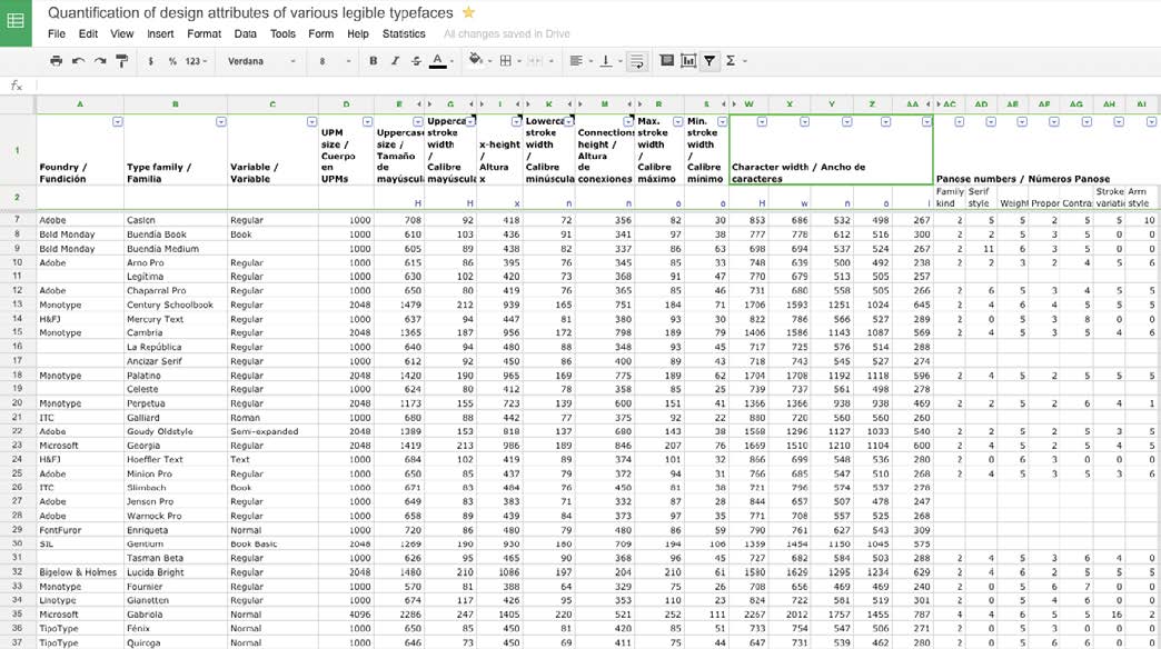
Fig. 2. Spreadsheet collecting the measurements made. Available here
When compared to the UPM size, these measures served the purpose of “capturing” the main proportions or DNA of the text typeface: its uppercase-lowercase ratio, its relative x-height, its relative stroke width, its contrast amount index, and also an index for how much horizontal space the font occupies, which I called advance width index. These numbers can now be compared, despite the fact that they come from fonts with diverse UPM sizes.
This is all very basic math and it was not at all difficult for fifty or sixty entries. The challenge comes when we consider huge font libraries consisting of thousands or hundreds of thousands of fonts and we still depend on manual measurements in order to extract some information from this data. Alternatives I can envision to solve this problem are either to do some scripting to skip the manual measuring or to rely on the Panose information of fonts to make these calculations. Even in this latter scenario, a script would come very handy. However, even if we could capture all this information effortlessly, how can we make something useful out of it? How to take advantage of the digital nature of fonts designed in recent decades?
Algorithms
At this point, algorithms can turn into something useful. Algorithms are at the core of computer programs since they are sets of step-by-step instructions which can be used to solve a problem or calculate something we consider important.
Recipes are good examples of algorithms. Font selection can be seen as a kind of problem which can be solved taking into account the particular requirements of our project and finding ways to narrow down the list of fonts which can match those needs. Furthermore subjective criteria could be applied in order to narrow down the shortlist even more, but subjective criteria is beyond the reach of this experiment.
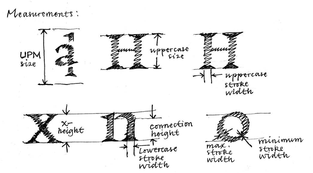
Fig. 3. An illustration of some of the design parameters that were measured.
A logical series of steps to find the right typeface for a given project starts with the question of what we need this typeface to do. More specifically, a list of requirements would need to be defined and the candidate fonts should (at least in theory) meet those requirements. Logically, the more requirements, the less probable it is that a given typeface can meet them, therefore a smaller number of results can be expected. This is an operation between sets, an intersection, which can be represented with a Venn diagram.
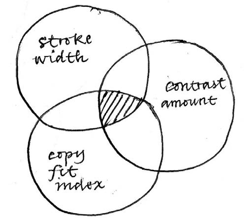
Fig. 4. Venn diagram of the selection process in which sets of data organized by parameters intersect, narrowing down the options as a consequence.
We can test this hypothesis by, for example, trying to find an appropriate typeface for setting the footnotes in a book. Even though all the details of the project that we can provide will certainly have an effect on the decision we make, let us imagine we are looking for something more or less generic and that we have a font library of about 80 type families installed on our computer, which is around 250 fonts. Each step should be aimed at narrowing down the list as much as we can, without discarding any good option. In the end, just a handful of fonts should remain, and all of them should be good candidates for the job.
The first step would be focusing our search on those fonts with a proper stroke width. Caption and sub-caption weights, slightly darker than “normal” text fonts but lighter than bold fonts should be easily detected. Those fonts tend to have a relative stroke width close to 20% and a large x-height to compensate their small size on the page.When we compare the x-height of text fonts with their relative stroke width (see scatter graph) we will see a great variety of possible combinations and a cluster near the axis 20% of relative stroke width and 45% of relative x-height. Most serif text fonts in any font library tend to be located near these values.
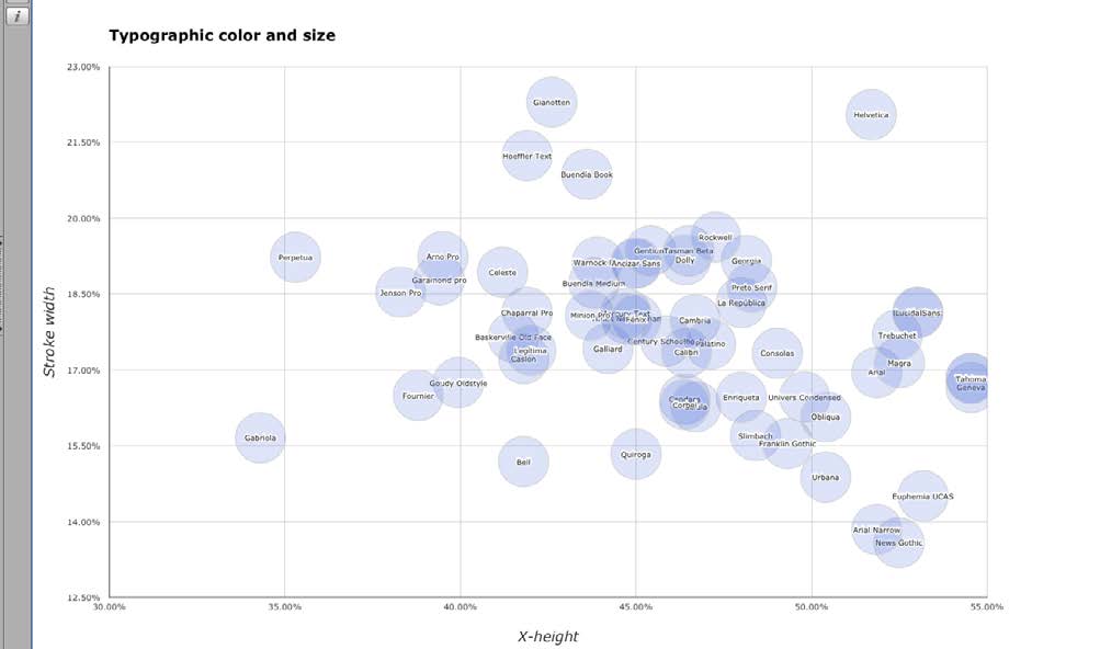
Fig. 5. Scatter graph showing the location of specific fonts in the design space according to stroke width and x-height.
A straight line crossing points (45%, 20%) and (55%, 18%) coincides with the best matches for caption fonts, at least in terms of x-height and stroke width.
A second step and additional criteria that could contribute to narrowing down our search results include a mapping of the amount of contrast in function of the relative x-height. When we take a closer look, we will see a clear correlation between these two parameters: the lower the contrast, the larger the x-height. Most sans serif and Egyptian fonts can be found towards the top right corner of the graph, whereas most high-contrast text fonts can be found near the bottom left corner. Fonts near the middle values of both axes would correspond to more balanced text types.
Choosing a handful of fonts whose x-height ranges between 45-55%, with a relative stroke width of 18-20% and a contrast amount of 0.5 to 1 seems a reasonable method for finding a good type for use in the footnotes of our imaginary book. In the library analyzed, just a handful of fonts meet those requirements: Ancízar Sans, Dolly, Fénix, Gentium, Lucida Sans, Preto, and Rockwell. Prior to this exercise, I would not have considered most of them, because I did not even know they could do the job. From this shortlist, depending on our specific situation, we can choose the one that we like better, or the one that is cheaper. The threshold values of each successive search can be adjusted so that we can get more or less results.
We can design different algorithms for a range of different situations. For instance, a display type for a newspaper could be found using an algorithm that gives a high score to the fonts with the highest contrast values, average x-heights, and low copy fitting index, defined by the relative widths of sample uppercase and lowercase glyphs. A good text type for very narrow columns can be found using an algorithm giving a high score to fonts with a normal x-height, average stroke width, and economic horizontal proportions matching low copy fitting index values. An adequate typeface for setting text in German could be the search result of those fonts presenting medium to low difference between upper and lowercase height. The possible applications of this approach are quite interesting and have not been tested sufficiently.
Conclusions
In spite of this being a work in progress, the following conclusions can be drawn:
- Current technology could greatly facilitate the processes of type selection, type design, and font substitution in ways still unexplored. Many important formal attributes of text and even display fonts can be reduced to numbers which can be used to make operations useful for helping designers make decisions in the processes aforementioned. The method presented is still far from perfect, but better than nothing, especially when type education is unavailable or insufficient.
- The main limitation of an algorithm-based system of font selection is the availability of data. As I mentioned earlier, the only well-known source of data containing design proportions is the Panose number included in many fonts, mostly system fonts. Unfortunately, this method will yield results based on subjective perceptions, not on accurate measurements and this is a problem if our intention is to make further comparisons, set thresholds, or find correlations. This is why I decided to measure all the values manually and to make a spreadsheet with all of them. However, this is far from being automated or any faster than making decisions by other means. So if the idea is to make an application out of this, an easier way of collecting data is imperative.
- There seems to be some sort of “goldilocks zone” in type design2 . Most text typefaces re located in the same relative area when design parameters such as contrast amount (0.3-0.6), weight (16%-20%), x-height (45%-50%) and copyfit index (5.0-7.0) are mapped out. This means convention and legibility are concepts which can be explained in terms of location in a design space, a situation far from almost any extreme value along any parameter.
- The Panose system should be revised and its implementation be made more popular among type designers. The grid it uses to define design values is too coarse and many fonts will appear to share the same space if compared in function of only one or 2 parameters. Since it was conceived to find substitute fonts, this comes as no surprise. However, the system can be good for many things other than just finding substitutes for missing fonts, it could be used for selecting fonts and also for conceiving new ones.
- A standard or convention on the meaning of each one of the variables in the Panose system mean is necessary to make font substitution, selection and design more effective and less intuitive processes that take advantage of current technology.
- The validity of type classification systems and their usefulness for choosing and designing type should be tested against the current measurements of fonts and their compared attributes. Entirely new categories could emerge whereas others could merge into existing ones. In any case, permanent reflection on this subject is highly advisable.
References
- BALIUS, A., & Sesma, M. (2010). Tipo elige tipo. Dieciseis tipógrafos nos enseñan a elegir tipografías. Madrid: Tipo e.
- BRINGHURST, R. (2004). The elements of typographic style. Point Roberts, WA: Hartley & Marks, Publishers.
- DOBELLI , R. (2013). El arte de pensar. Barcelona: Ediciones B.
- HELLER, S., & Meggs, P. B. (2001). Texts on type: critical writings on typography. New York: Allworth Press.
- HOFSTADTER, D. R. (1982). Metafont, metamathematics, and metaphysics. Bloomington, IN: Computer Science Dept., Indiana University.
- KAHNEMAN, D. (2011). Thinking, fast and slow. New York: Farrar, Straus & Giroux.
- KAROW, P. (2013). Digital typography & artificial intelligence. S.l.: Adobe.
- MCRANEY, D. (2011). You are not so smart: why you have too many friends on Facebook, why your memory is mostly fiction, and 46 other ways you're deluding yourself. New York: Gotham Books/Penguin Group.
- NOORDZIJ, G. (2005). The stroke: theory of writing. London: Hyphen.
Internet References
- DE LAURENTIS, M. (1993). Panose 2.0 White Paper. http://www.w3.org/Fonts/Panose/pan2.html. Consulted in October, 2015.
- Dixon, C. (2002). Type classification. Lecture given during the Twentieth Century Graphic Communication: Technology, Society and Culture, first annual Friends of St Bride conference, september 24-25, 2002. Consulted in December, 2012.
- Grandsire, C. (2004). The Metafont Tutorial. http://metafont.tutorial.free.fr/downloads/mftut.pdf. Consulted in october, 2015.
- Kupferschmid, I. (2013). Type classifications are useful, but the common ones are not. Available from http://kupferschrift.de/cms/2012/03/onclassifications/#overview. Consulted in February, 2013.
- Van Blokland, Erik. Type Media Type Cooker. http://www.typeccoker.com Consulted in May, 2013.
Footnotes
- Globally search a Regular Expression and Print. A technique used in digital typesetting that allows typographers to describe patterns in text in order to make automatic substitutions. Ir al texto
- The term is borrowed from astrophysics and in this context it refers to the habitable region around a star that has just the right conditions to find liquid water on a planet’s surface, a key ingredient in the search for life. In the context of type design it means that text typefaces have just the right amount of contrast, weight, width and x-height to optimize reading in body text sizes and immersive conditions. Ir al texto
Databases of digital fonts as sources for providing alternatives for font selection
Bases de datos de fuentes digitales como fuentes para proporcionar alternativas para la selección tipográfica
Bases de données de polices numériques comme sources pour fournir des alternatives pour la sélection de polices
Basi di font digitali come fonti per la fornitura di alternative per la selezione dei caratteri
Bancos de dados de fontes digitais como fontes para fornecer alternativas para seleção tipográfica
Referencias
BALIUS, A., & Sesma, M. (2010). Tipo elige tipo. Dieciseis tipógrafos nos enseñan a elegir tipografías. Madrid: Tipo e.
BRINGHURST, R. (2004). The elements of typographic style. Point Roberts, WA: Hartley & Marks, Publishers.
DOBELLI , R. (2013). El arte de pensar. Barcelona: Ediciones B.
HELLER, S., & Meggs, P. B. (2001). Texts on type: critical writings on typography. New York: Allworth Press.
HOFSTADTER, D. R. (1982). Metafont, metamathematics, and metaphysics. Bloomington, IN: Computer Science Dept., Indiana University.
KAHNEMAN, D. (2011). Thinking, fast and slow. New York: Farrar, Straus & Giroux.
KAROW, P. (2013). Digital typography & artificial intelligence. S.l.: Adobe.
MCRANEY, D. (2011). You are not so smart: why you have too many friends on Facebook, why your memory is mostly fiction, and 46 other ways you're deluding yourself. New York: Gotham Books/Penguin Group.
NOORDZIJ, G. (2005). The stroke: theory of writing. London: Hyphen.
DE LAURENTIS, M. (1993). Panose 2.0 White Paper. http://www.w3.org/Fonts/Panose/pan2.html. Consulted in October, 2015.
Dixon, C. (2002). Type classification. Lecture given during the Twentieth Century Graphic Communication: Technology, Society and Culture, first annual Friends of St Bride conference, september 24-25, 2002. Consulted in December, 2012.
Grandsire, C. (2004). The Metafont Tutorial. http://metafont.tutorial.free.fr/downloads/mftut.pdf. Consulted in october, 2015.
Kupferschmid, I. (2013). Type classifications are useful, but the common ones are not. Available from http://kupferschrift.de/cms/2012/03/onclassifications/#overview. Consulted in February, 2013.
Van Blokland, Erik. Type Media Type Cooker. http://www.typeccoker.com Consulted in May, 2013.
Cómo citar
APA
ACM
ACS
ABNT
Chicago
Harvard
IEEE
MLA
Turabian
Vancouver
Descargar cita
Licencia
Información sobre acceso abierto y uso de imágenes
El contenido y las opiniones incluidas en los trabajos publicados por ACTIO Journal of Technology in Design, Film Arts, and Visual Communication son de responsabilidad exclusiva de los autores para todos los efectos, y no comprometen necesariamente el punto de vista de la revista. Cualquier restricción legal que afecte los trabajos y su contenido (en cualquier formato: escrito, sonoro, gráfico, videográfico) es responsabilidad exclusiva de quienes los firman.
La Revista no se hace responsable de aspectos relacionados con copia, plagio o fraude que pudieran aparecer en los artículos publicados en la misma, tanto por textos, imágenes o demás susceptibles de protección. Por ello exige a los autores respetar y acoger todas las normas nacionales e internacionales que al respecto rijan la materia, incluyendo el derecho a cita. Los contenidos de los artículos son responsabilidad de los autores.
Los trabajos se publican con acceso libre, lo cual permite copiar y redistribuir los trabajos publicados, siempre que:
- Se cite la autoría y la fuente original de su publicación (nombre de la revista, volumen, número, números de página, año de publicación, el título del trabajo, editorial y URL de la obra);
- No se usen para fines comerciales;
- No se modifique ninguna parte del material publicado;
- Se soliciten los permisos correspondientes para reutilización o reedición del material publicado; y
- Se mencione la existencia y especificaciones de esta licencia de uso.